Year: Spring 2020
Duration: 6 months
Program: Loughborough UX Design Master's Program
Project Type: Individual
Role: Research/Design Lead
Tools: Adobe: XD/InDesign/Illustrator/Photoshop
Brief: "Individually select, develop, manage, and deliver an appropriate and detailed UX or service design project of your own choosing. Specifically, focus on the application and management of an appropriate iterative and Human Centered Design process."
BACKGROUND
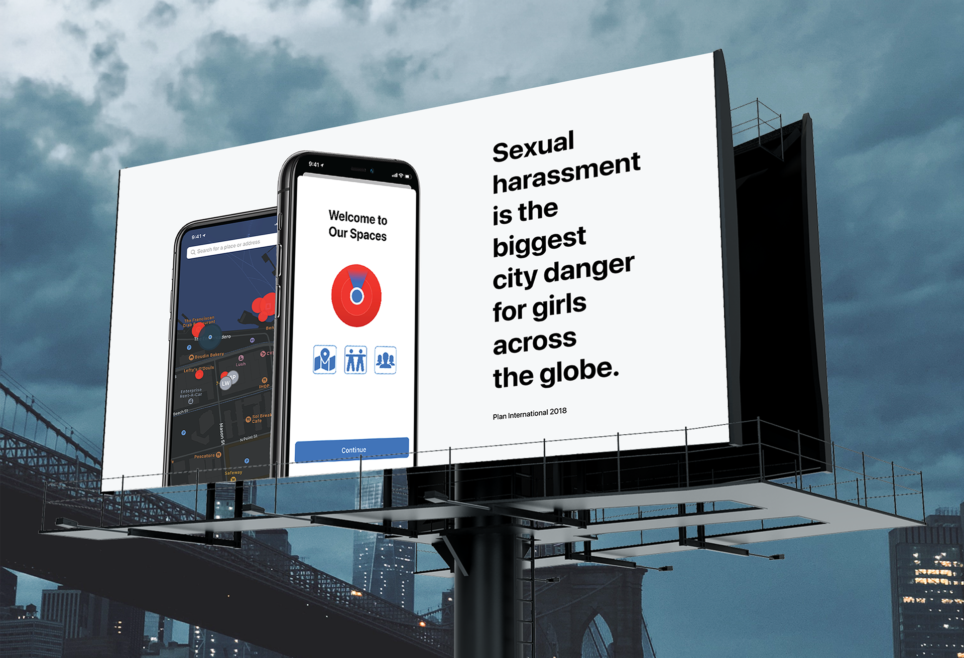
While laws against sexual harassment have emerged only in recent history, the practice of sexual harassment is centuries old (MacKinnon, 2003). Today, harassment continues to threaten the safety of girls and women around the world; "violence against women, or gender-based violence, is a worldwide problem – and it’s everyone’s problem" (Amnesty International UK, 2018).
Girls and women are disproportionately affected by sexual harassment, and a specific strategy is needed to battle this disparity (Vawg Strategy, 2018 – 2021). Because sexual harassment is a multifaceted, stigmatized issue, statistics vary across surveys. While variances in data exist, there is a consistent upward trend. In 2015, researchers at Cornell University found that by the time women turn 17 years old, 84% of them will have experienced harassment in public (Spratt 2016), and noted that these numbers are rising.

Plan International (2018)
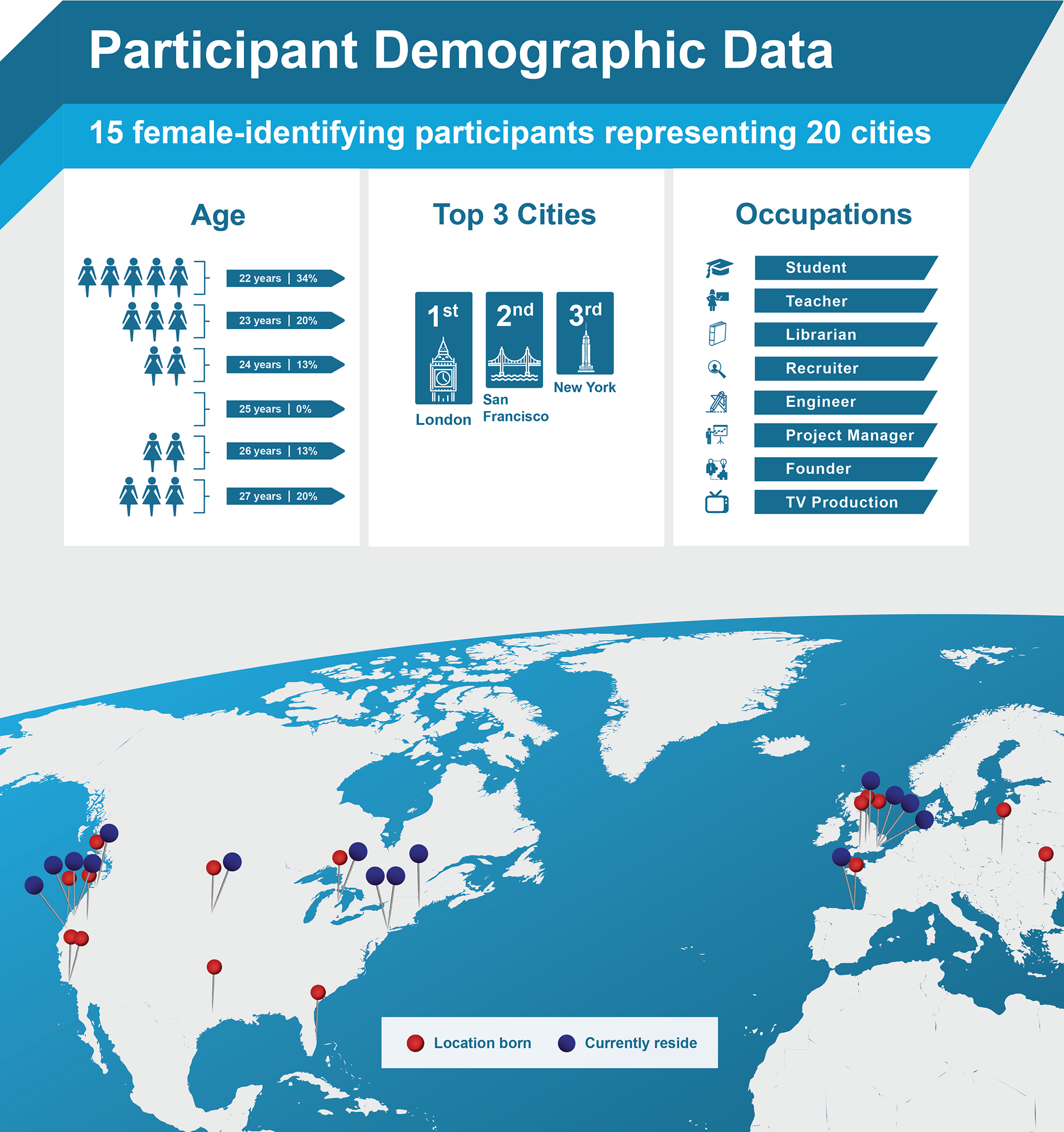
TARGET USER
This research focuses on female-identifying participants between the ages of 22 – 28 years old, who live in urban areas, independent from their families. The Harvard Graduate School of Education surveyed male and female-identifying participants between the ages of 18 to 25. Over 85% of female identifying-participants reported experiencing at least one form of sexual harassment (Ditkowsky, 2017). These transgressive behaviors include being catcalled, touched without permission or insulted with sexualized words by a stranger. Moreover, 80% of the respondents reported that their parents “failed to address and prevent misogyny and sexual harassment in their lives,” noting that they had never had a conversation with their parents about how to avoid sexual harassment (Cashin, 2017).

Image: A collection of stories shared by participants, including the physical location, city, and the participant’s age at the time of harassment
USER RESEARCH
In order to discuss a sensitive topic, such as sexual harassment, the participant must feel safe being vulnerable. With this in mind, it was made a priority, both through the ethics forms and direct discussions with the researcher, to make sure participants knew they had complete control over sharing as much or as little as they felt comfortable. Moreover, participants were explicitly told that anything deemed a “current trauma” should not be shared within the context of the primary research methods.
Demographic Surveys: Prior to engaging in primary research methods, participants were asked to complete a demographic survey, including age, ethnicity, occupation, marital status, etc. (Survey Monkey, N.D.).
Unstructured Interviews: Unstructured individual interviews were conducted with a conversational approach, aimed to help participants feel comfortable and safe sharing their personal experiences. Unstructured group interviews were used to capture participants’ perspectives and concerns that may not have surfaced within alternative primary methods (Keller 2019).
Reflective Journals: For the reflective journal, participants were asked to write letters to their younger selves, an idea inspired by an emerging theme from initial interviews. [For a participant, this activity] can be extremely useful for understanding their past and making sense of their future” (Hart, 2019). This can often serve as a cathartic introspection and provide a space to self-reflect in private before sharing their experiences.
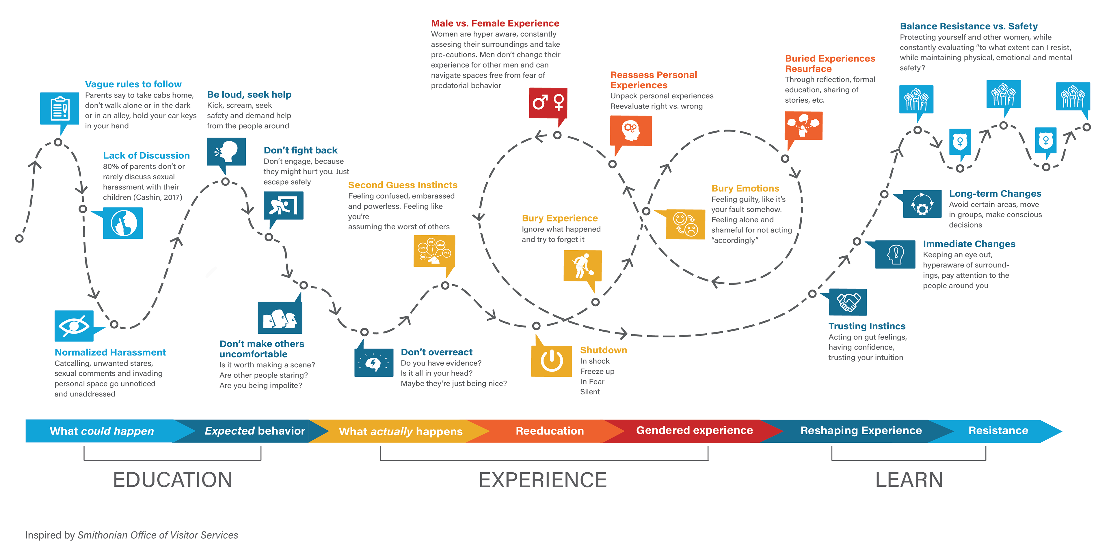
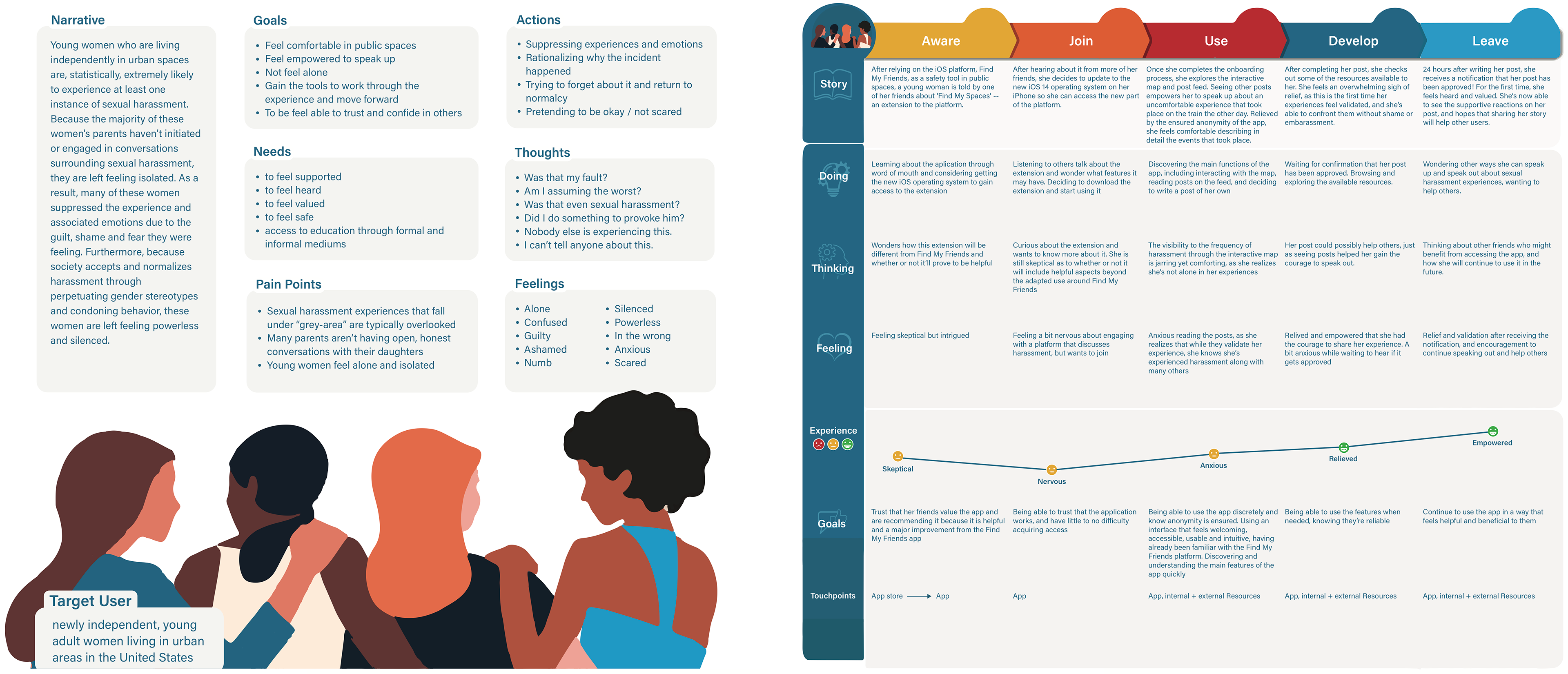
User Journey Map: This user journey map aims to unravel and deeply analyze the complex mental stages women go through as a result of experiencing sexual harassment. From the stories described in the interviews, this is an arduous journey that includes paralyzing incidents. It became evident that participants’ biological responses overpowered any notion to run, escape, or make a scene.
“I wanted to just get off the train and just like move or whatever, but I was literally so shocked, I just couldn’t do anything. I just stood there” (participant 1).
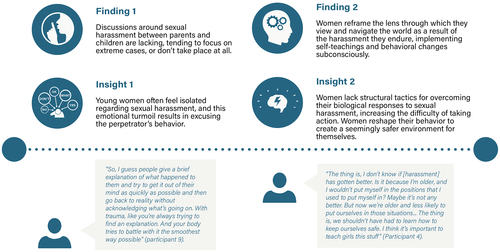
FINDINGS & INSIGHTS
Because harassment is often normalized, women are pressured to either disregard this behavior entirely or bury the experience in hopes of forgetting. This process can become cyclical, and the form of escape is to face and reevaluate the inappropriateness of these buried experiences. Through this reflection process, these women learned to navigate the world through a reshaped lens, doing their best to prioritize their physical, mental, and emotional safety, while being an active part of the resisting harassment. This is a constant balancing act.
TARGET USER ANALYSIS
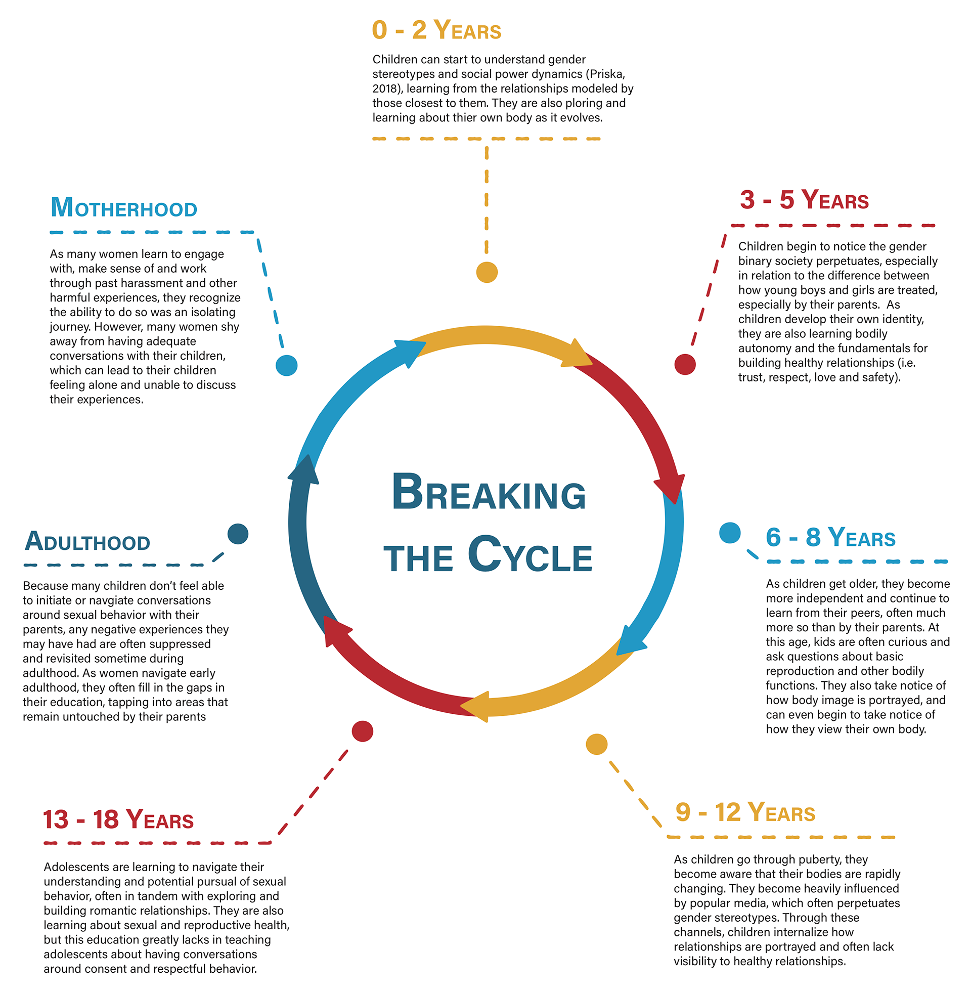
More often than not, parents fail to provide their children with the knowledge and support that would help them better navigate sexual harassment. Regardless, the responsibility most often falls on women to educate children on the subject of harassment. This begs an important question: if women are experiencing high rates of harassment, why aren't they teaching their daughters the very things they themselves would have hoped to learn? While a design opportunity lies within an education-based solution for children and parents, launching a solution focused on parent-to-child communication would prove to be an especially challenging, long-term approach; one that does not align with the current constraints of a COVID-19 world. If parents do not take part in the education experience, young women are, once again, left to fend for themselves.
Putting the power in women's hands minimizes the potential for the harmful cycle of isolation to continue. From exploring all target users relevant to the research question, young-adult women emerge as the best group to target, given the scope of this project. With online delivery becoming the main delivery mode for nearly all forms of education during the COVID-19 pandemic and young women being a major user of social media platforms and other web-based programs, there is a clear opportunity to provide young women with a tech-based solution that could be deployed in the palm of their hands.
Creating a design for young women keeps the project focused on providing an immediate solution for those who are at a disproportionately high risk of experiencing sexual harassment, prioritizing the 'here, now.'
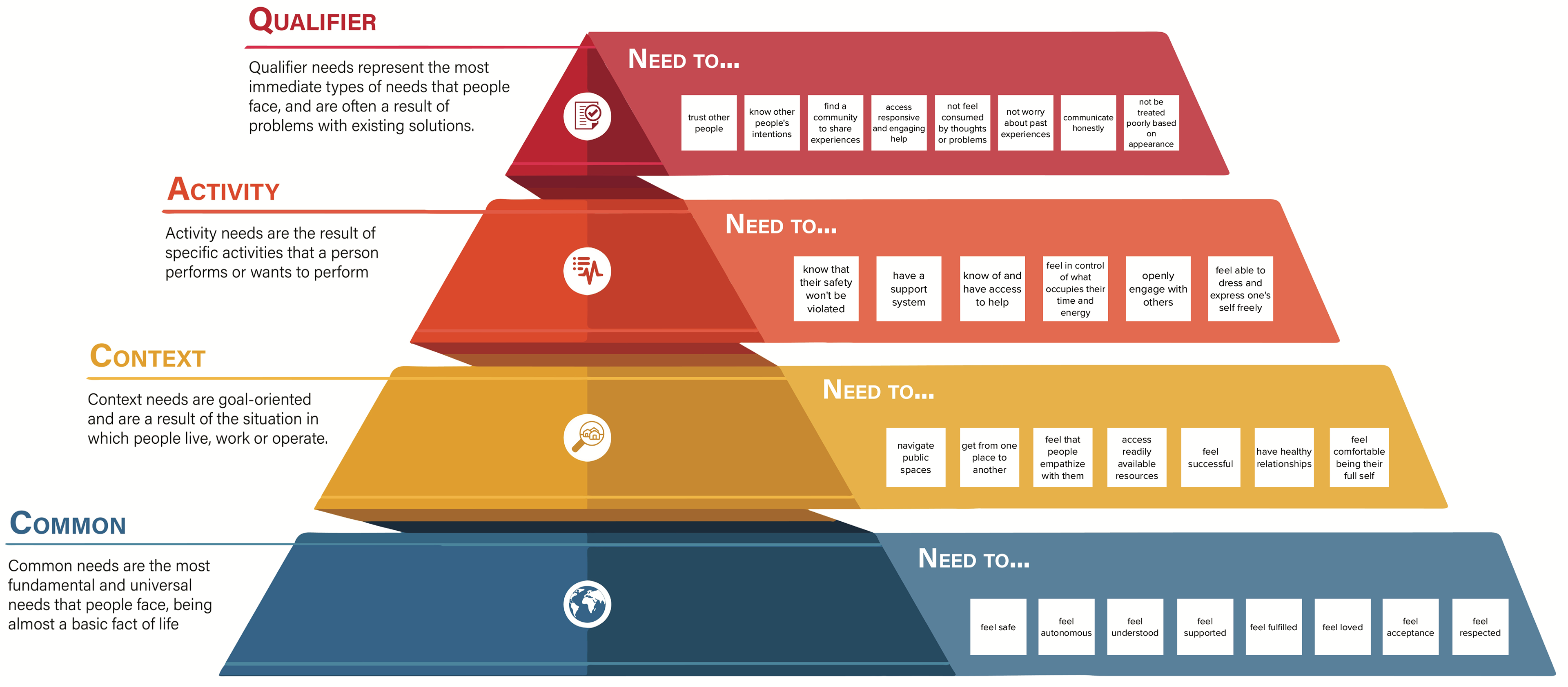
The target user's needs were further investigated using the Hierarchy of Needs framework - a tool adapted from Maslow’s Hierarchy of Needs (Patnaik, 2013). While Maslow’s Hierarchy organizes needs through a broad scope, analyzing “deep seated, long lasting problems that may not be fixed by a single solution” (Patnaik, 2013), this tool aims to understand the needs of the user within a particular context. Using this tool, in tandem with the behavioral archetype, creates a holistic understanding for the needs of young adult women within the context of sexual harassment.
CONCEPT IDEATION
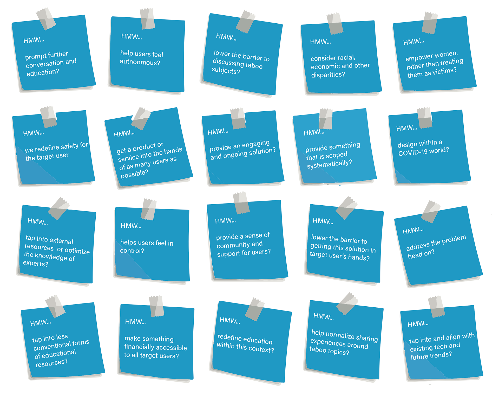
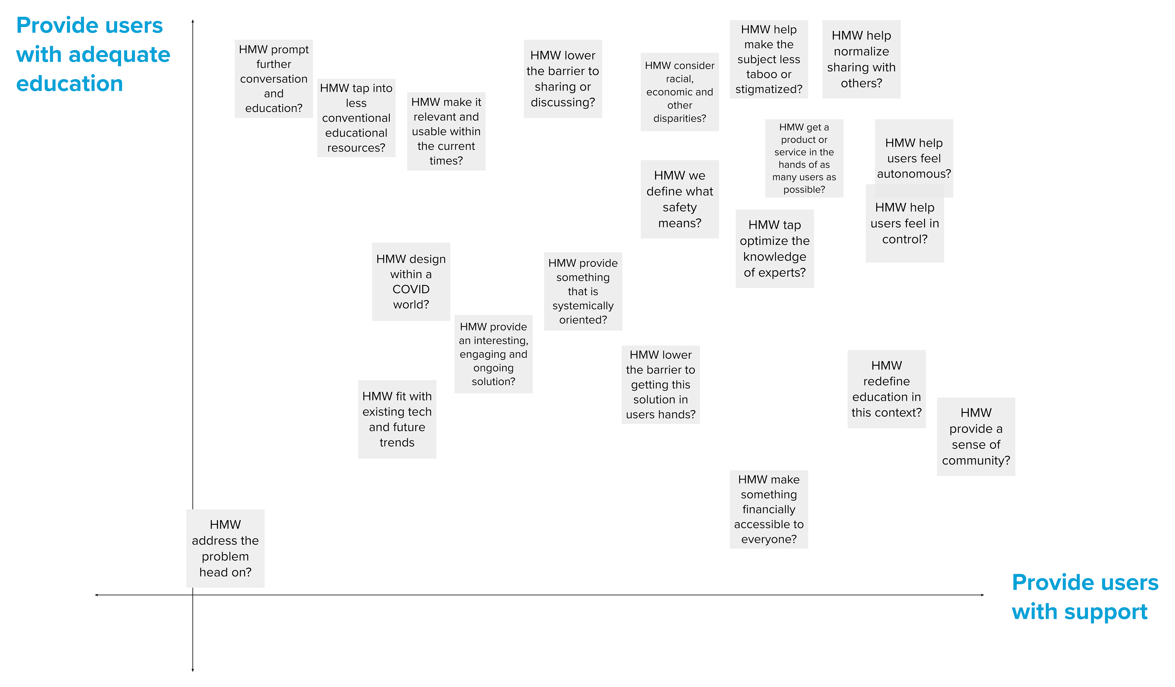
How Might We Statements: After gaining a more holistic understanding of the target user, I created as many HMW statements as possible to explore all areas of opportunity. These statements were created over three iterations, with a focus on intersectionality and inclusivity for target users. They were then refined to a selected 20 and organized using a basic matrix with two criteria in mind: providing users with adequate education and providing users with support. Evaluating the HMW’s against these two criteria revealed if and where they fell within the top right corner of the matrix, often considered the ‘sweet spot’.
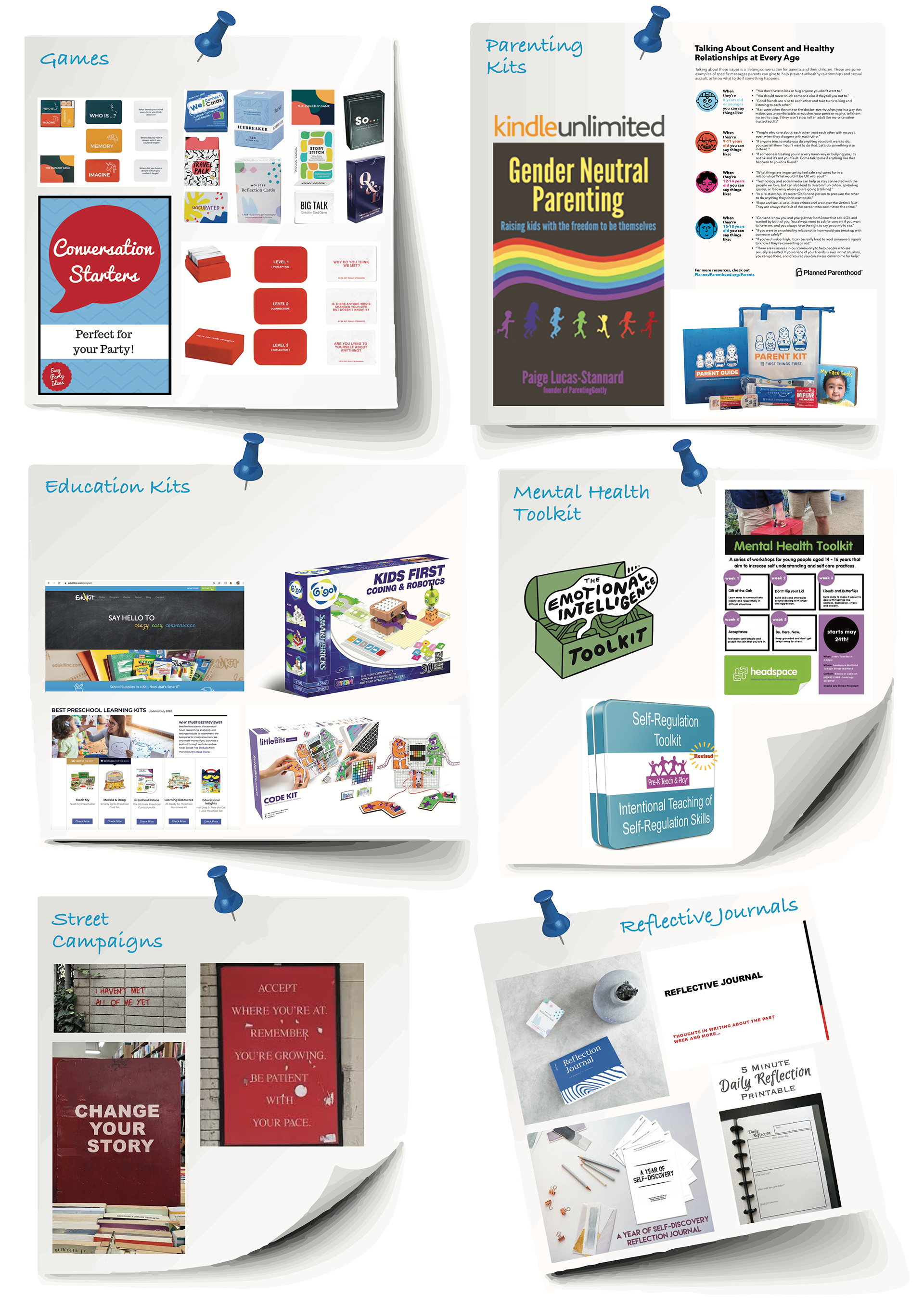
Idea Board: While a idea board typically focuses on visual communication and style elements, this idea board aims to explore existing education-based products and solutions. These ideas included social movement campaigns, interactive books and journals, conversation prompting games and activities, education kits and subscription programs. By exploring a variety of education-based solutions, this exercise revealed that filling the education-gap identified within the user insights doesn’t necessarily need to be provided through formal methods.
There is an opportunity to explore less conventional ways that young women access education.

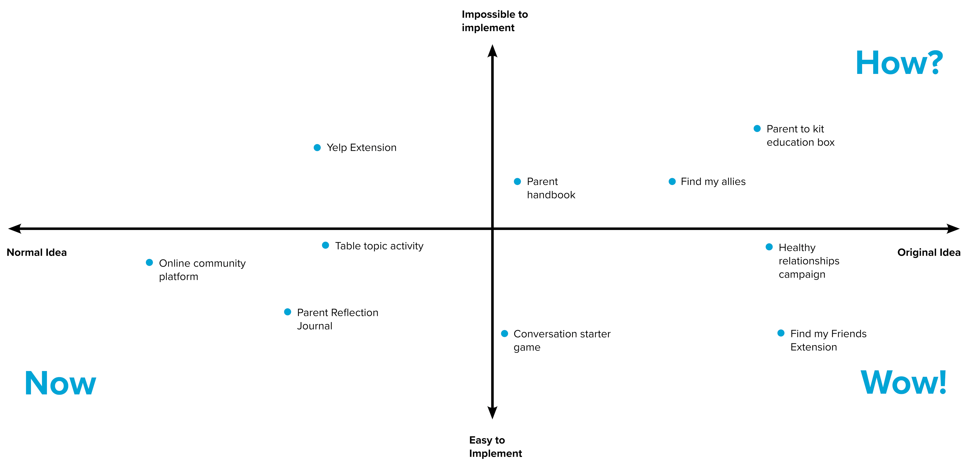
Crazy 8's: The crazy 8’s exercise was completed (Design Sprints, 2019) to build off of the idea board, focusing on reducing barriers and mental limitations during the ideation process by generating as many ideas as possible in 8 minutes. Through this exercise, technological solutions, toolkits, games, and campaigns were ideated.
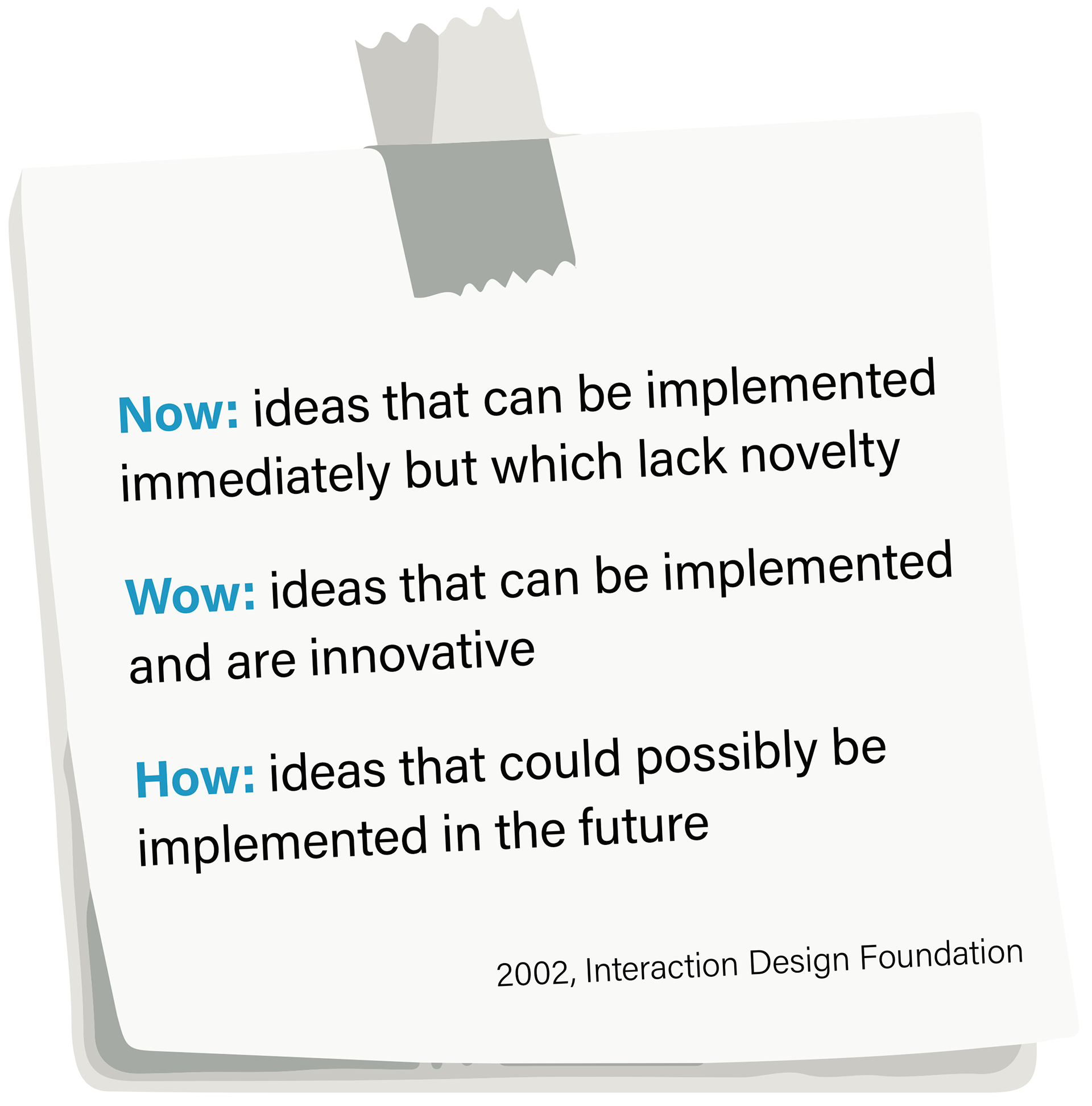
To evaluate these ideas within a broader context, a 'How, Now, Wow!' matrix was used (Dam, 2018), organizing them into four quadrants. The optimal quadrant, being most 'original' and 'feasible to implement, revealed the most innovative and meaningful concepts with which to move forward.
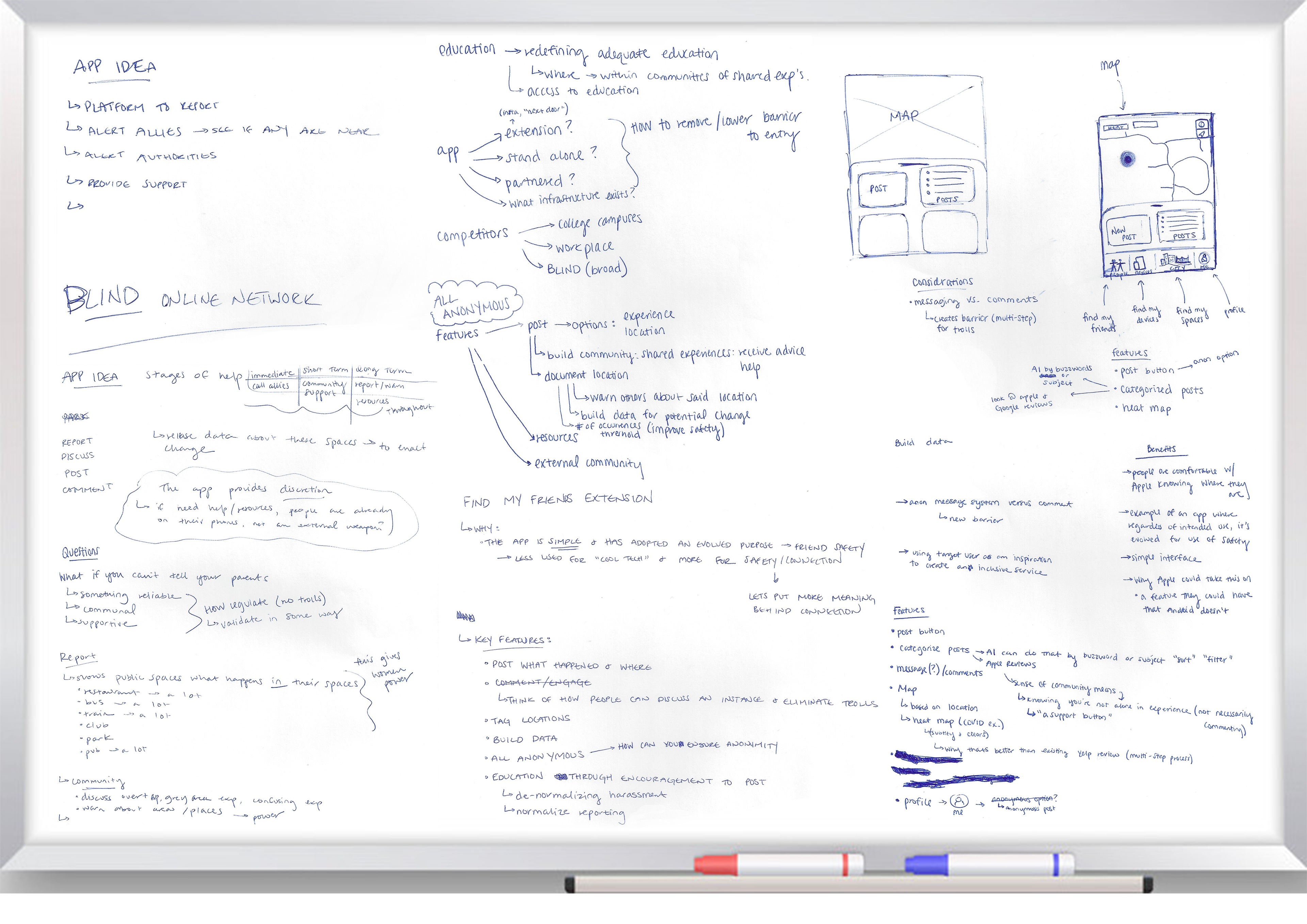
Co-Design: A Co-Design session was used to discuss top ideas. Through this conversation, there was a unanimous decision to move forward with the online community platform. Much of this decision was influenced by considering the reality of the “here, now”, within our digital, COVID-19 world. Once the decision was made, it transitioned to exploring possible features, functions and imperatives for the online platform. Additionally, several competitors were mentioned and written down for future competitor analysis.
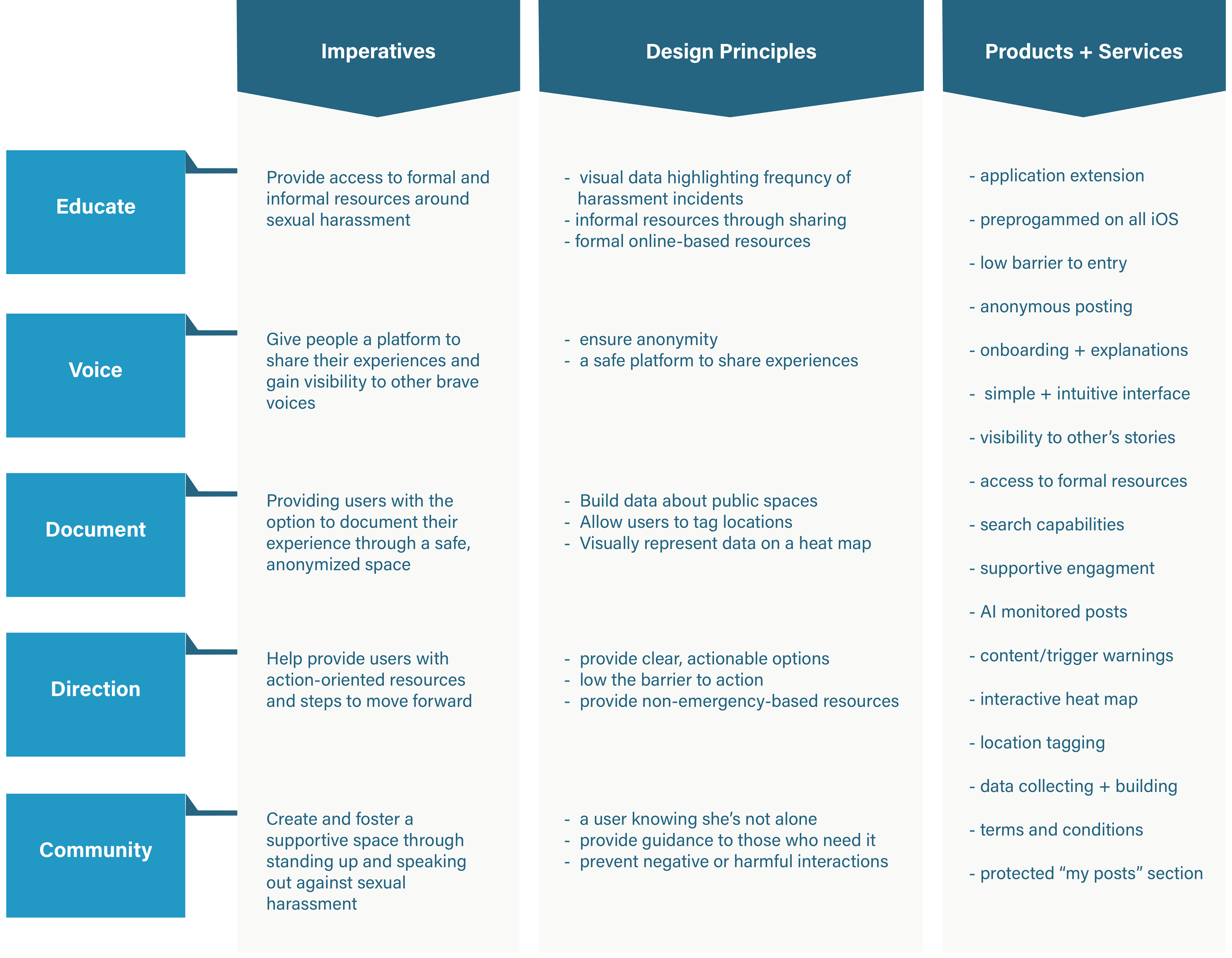
To formalize a design direction within the scope of the concept statement, a Design Principles Chart was used (Patnaik 2013). This complex strategy includes three distinct sections that serve as the foundation. The products and services section includes design features that, based on the first two criteria, could be implemented within the concept generation phase.
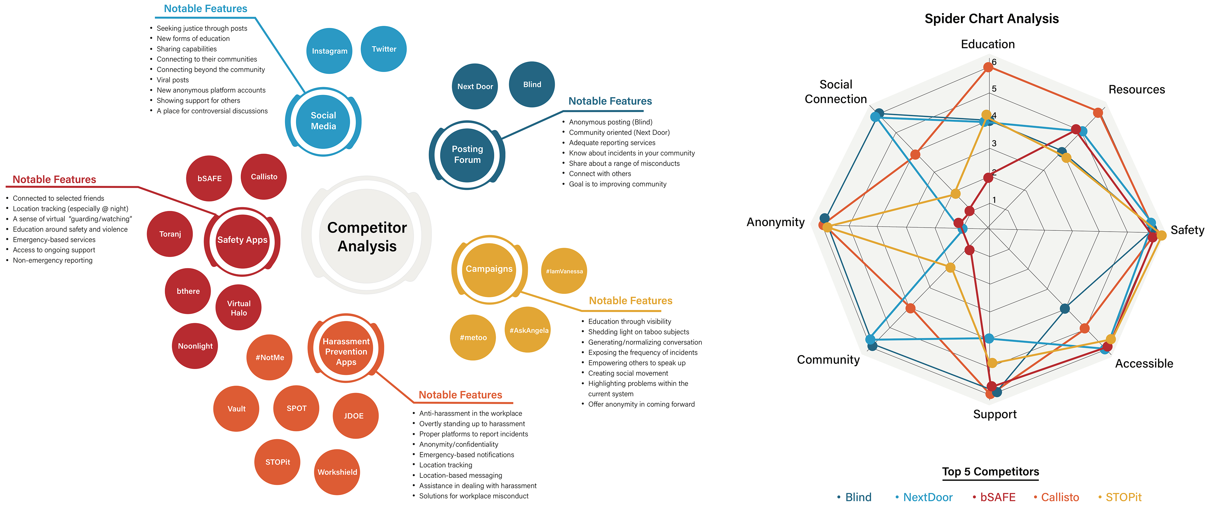
Following a comprehensive analysis of the concept’s architectural components, a competitor analysis was carried out. Competitors were identified through extensive research and were then categorized and displayed using an SEO Competitor Analysis Chart based on commonalities and similar noteworthy features.
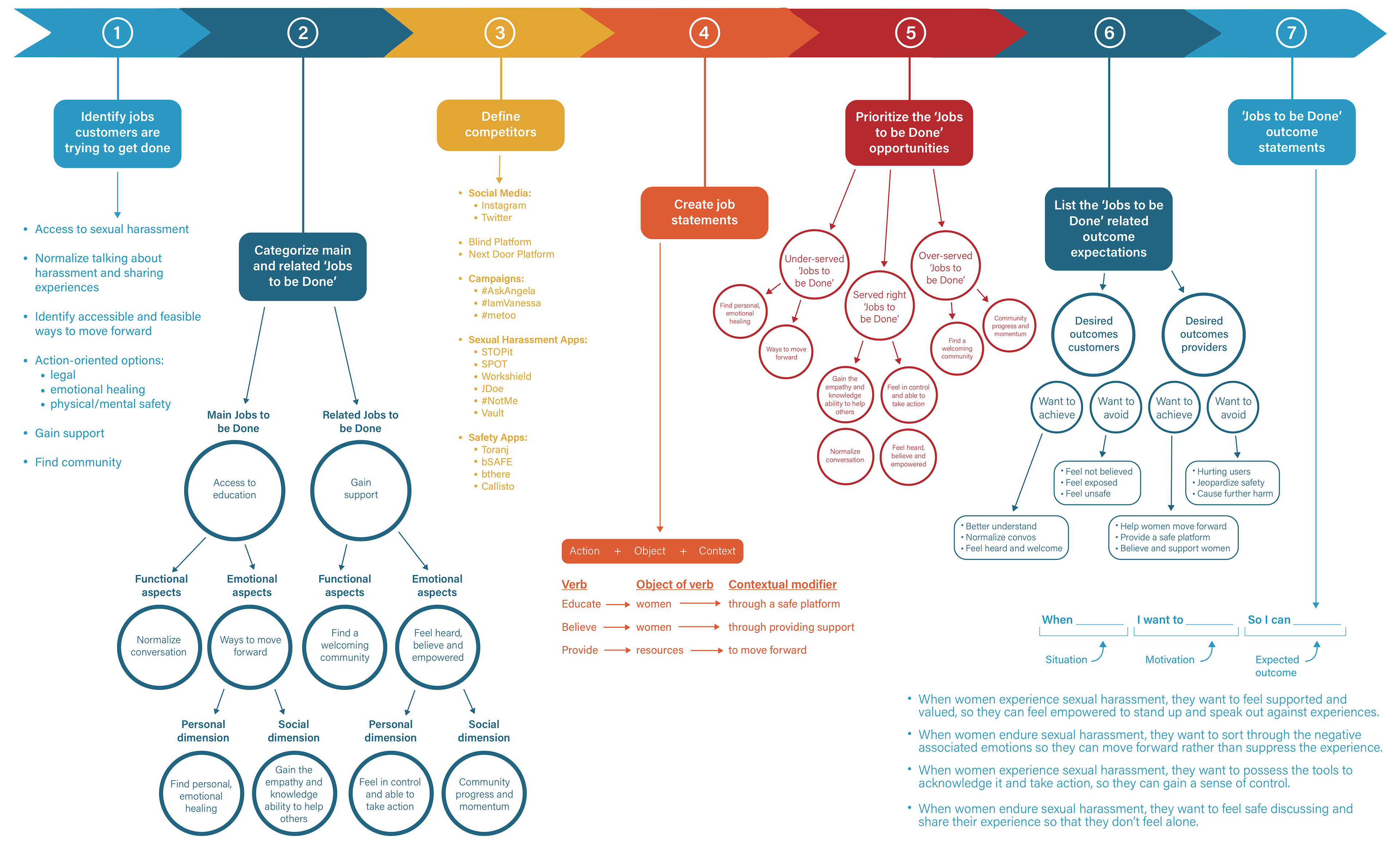
Once organized into groups, five competitors that demonstrated top safety and education features and aligned with the target user’s needs, were further evaluated using the Competitor Analysis Spider Chart (Freeman, 2020). This “data visualization method” is “effective for comparing two or more products over a range of characteristics” (Freeman, 2020). This tool revealed how competitors cater to their target audience and exposes the gaps within their current services where they are under-serving their target users.
With a clear design direction, the 'Jobs-to-be-Done' framework (Gecis, 2015) was used to assess the implementation and feasibility of the concept. Each stage of this method served a different purpose. Through this exercise, I was able to establish and organize the concept's goals from the provider and consumer perspectives. This exercise helped surface which aspects of the concept are over-serving, under-serving or serving the user just right. It revealed the desired and undesired outcomes from the jobs to be done, and which ones the customer and provider want to achieve and avoid.
Co-Design: The second co-design session centered around the pros and cons of creating a stand-alone app, as doing so may create a barrier to entry for users. One designer suggested creating an extension that could be integrated with an existing app, particularly focused on one with which the target user already actively engages. Some of the apps considered included social media apps like Instagram, review style apps like Yelp and Apple Maps, location-based apps like Find My Friends and existing safety apps.

REFINED TARGET USER ANALYSIS
Following a productive co-design session centered around concept ideation and exploring possible apps with which to integrate, that target user was refined through a behavioral archetype and user journey map. These exercises helped organize the user's goals, pain points, needs, and emotions. Doing so helped clarify the design scope prior to entering the prototyping phase. While the target user was refined, the concept would be designed with the intent of reaching a broader target audience in the future.
CONCEPT REFINEMENT
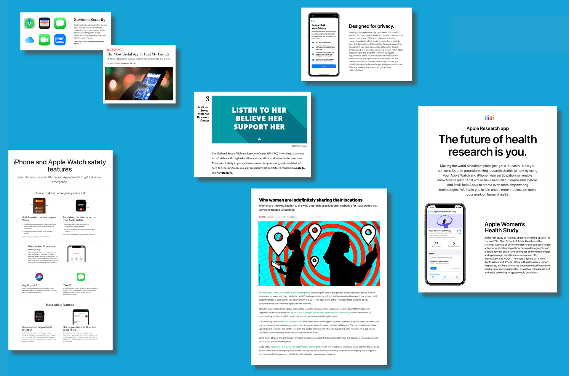
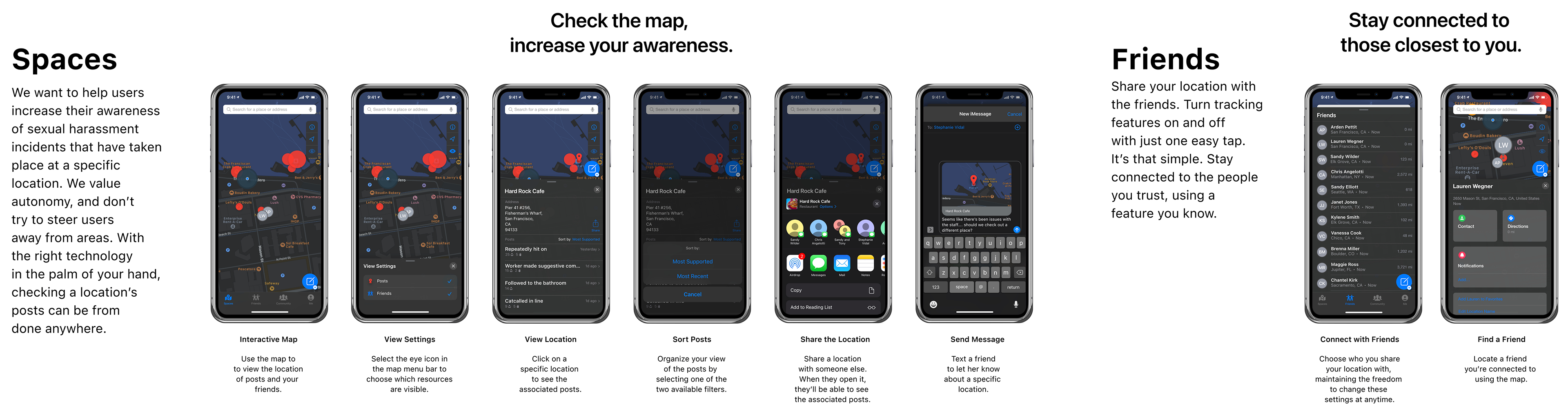
Through an in-depth brainstorming and analysis process, I identified Find My Friends as one of the main tools women use to create seemingly safer environments and stay connected to their friends and family. In a recent iteration of iOS, Apple chose to combine Find My Friends with Find My Devices, creating the 'Find My' app. While the app's intended use is social connection, its adapted use, within this context, is centered around safety. I further analyzed the ways women use the 'Find My' app through a broader, systemic scope to assess the feasibility of immediate integration within Apple’s ecosystem of iOS apps. This mindmap aims to evaluate the possibility of partnering with Apple in the future, based on their current partnerships with third party organizations and their existing safety-oriented features.
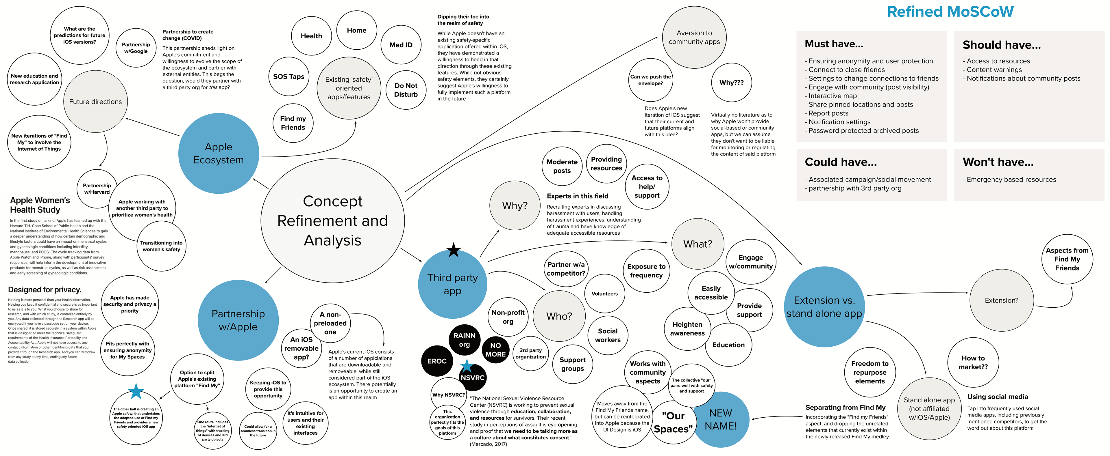
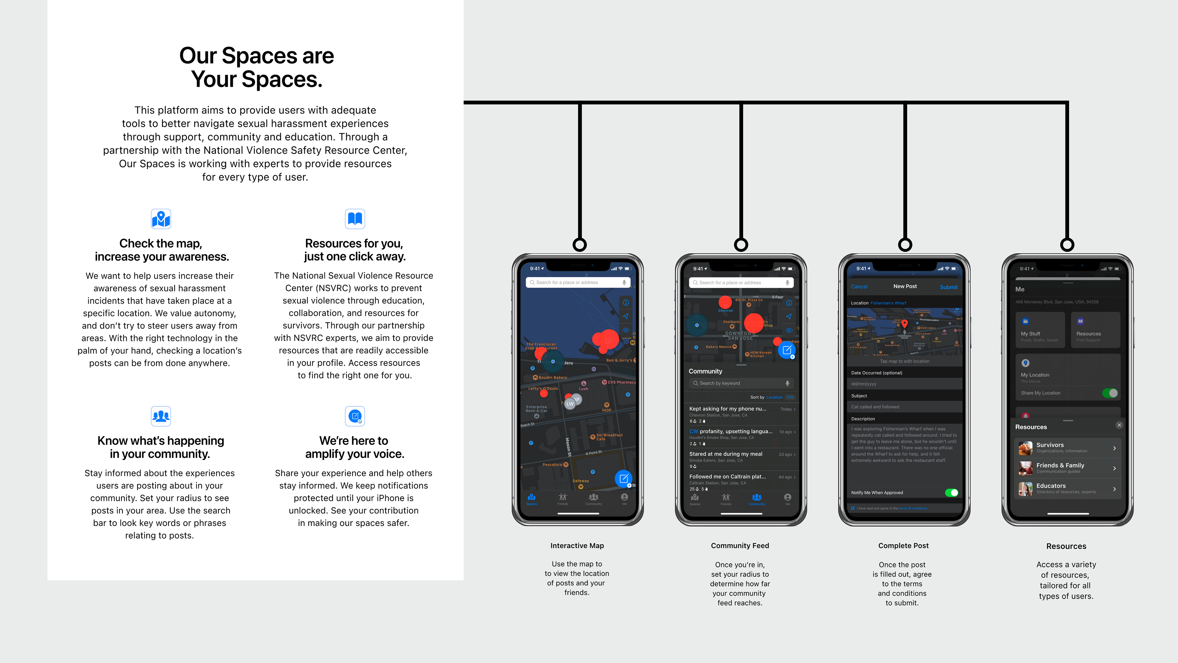
Through an in-depth analysis of Apple’s future directions, current platforms and interest in the realm of safety, there is a strong argument for framing the final design around future integration. While Apple has yet to create a safety-focused app, the features they provide through a variety of iOS platforms reveal that they value their users’ safety. Furthermore, their partnerships with Google and Harvard highlight their commitment to public safety. While Apple would not be the key partner for the final design, the app UI would remain in iOS create seamless integration in the future. From this technique, the National Sexual Violence Resource Center was identified as the optimal partner with which to move.
While proposing immediate integration within Apple’s current ecosystem of preprogrammed iPhone apps would be unrealistic, the concept was designed using iOS 14 in anticipation of future implementation. While this may seem far fetched, Apple has proven their commitment to safety through their current application features and external partnerships. These points make for a strong argument as to why the final design should maintain its iOS UI. To immediately incorporate experts within this space, the National Sexual Violence Resource Center was identified as the optimal third party organization to partner for the final design.
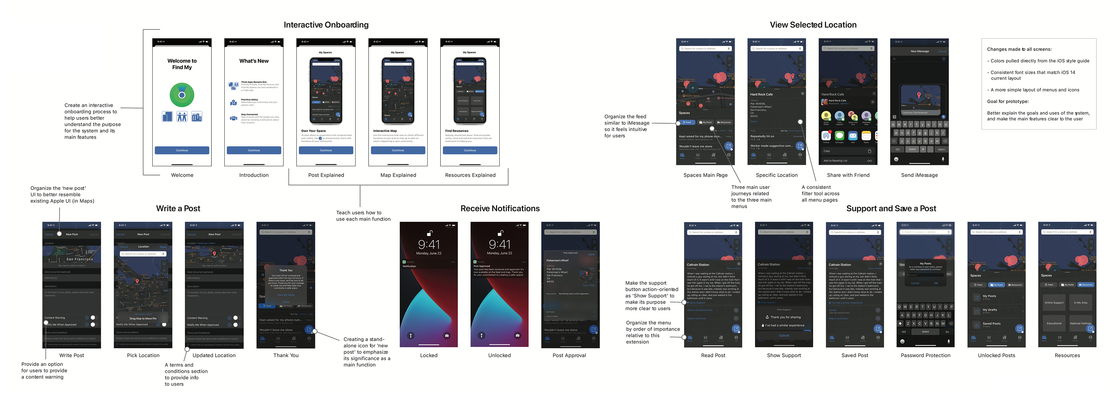
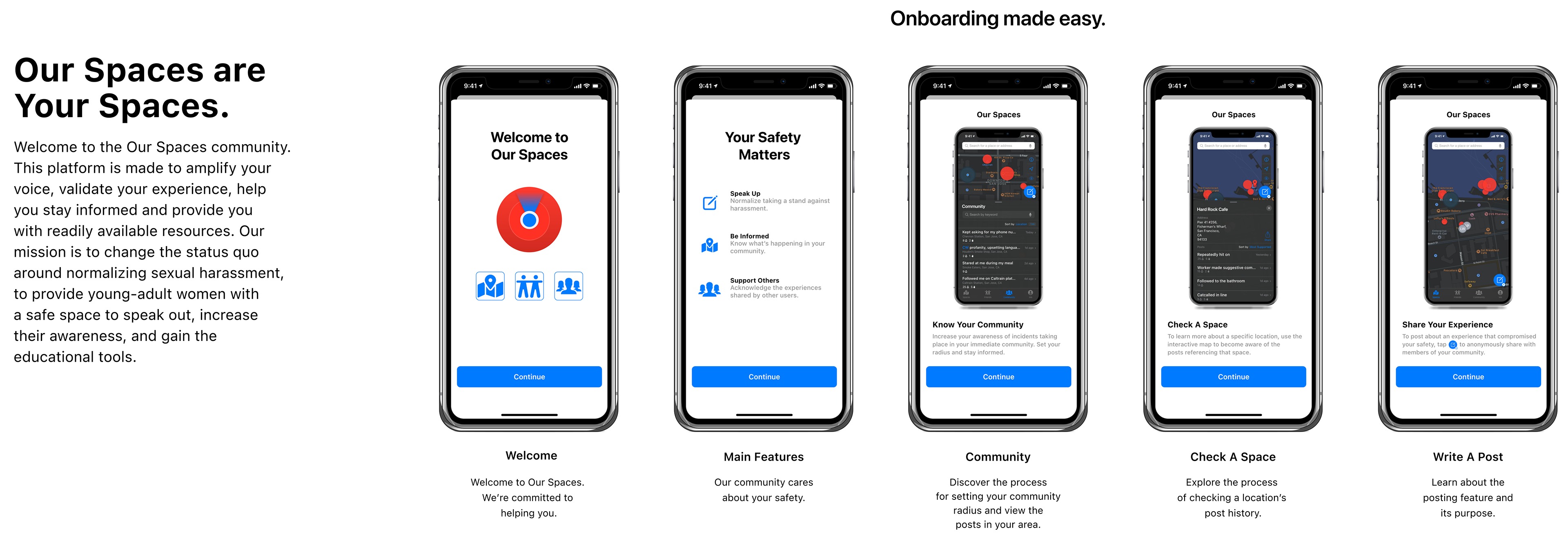
PROTOTYPING + USER TESTING
To kick off the prototyping process, initial wireframe drawings were used to explore possible UI layouts, specifically focused on the global navigation and menu options. Additionally, this exercise was used to brainstorm possible user journeys within the app, and identify which three options best encompassed the main app features and focused on helping the user accomplish their goals.
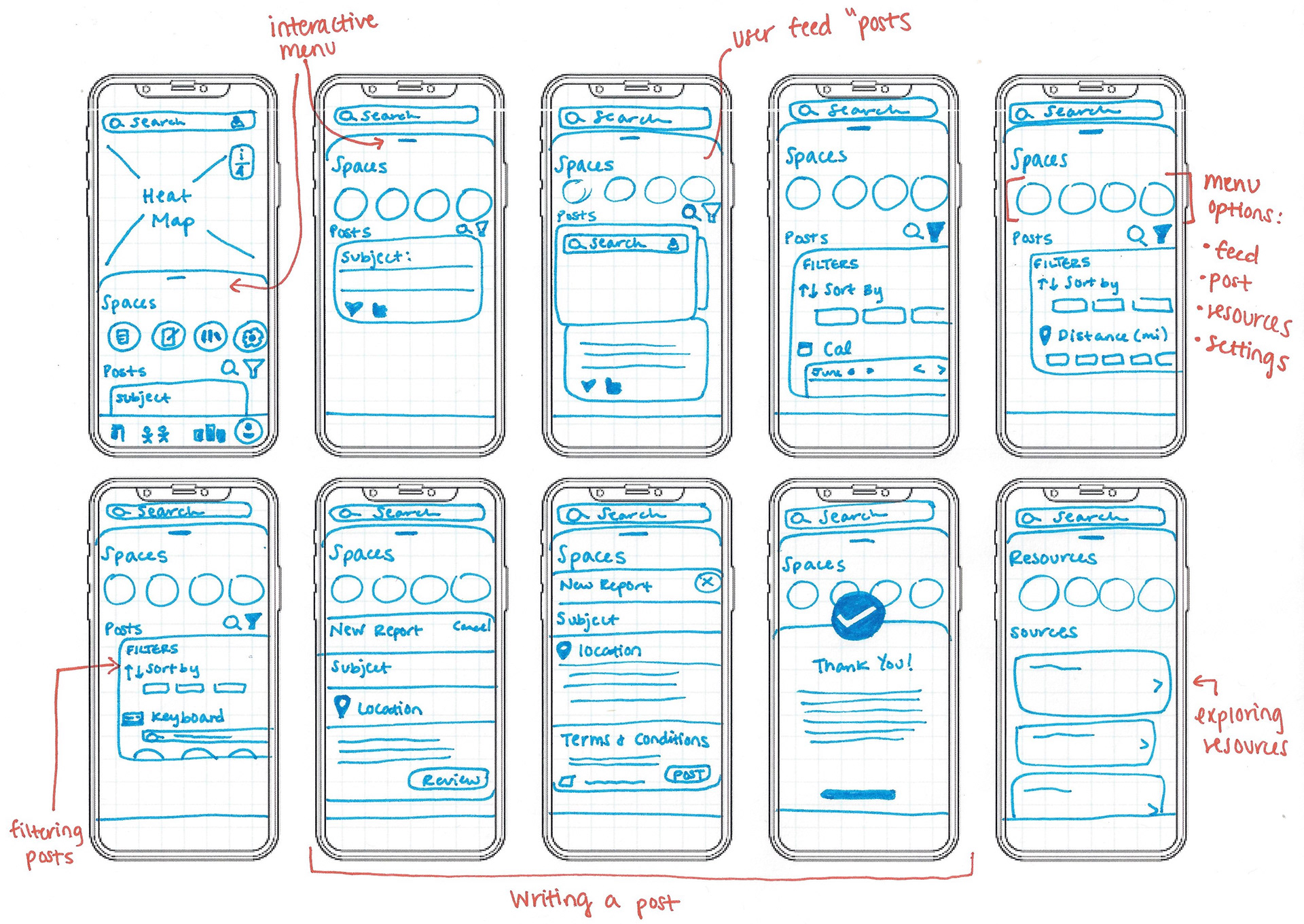
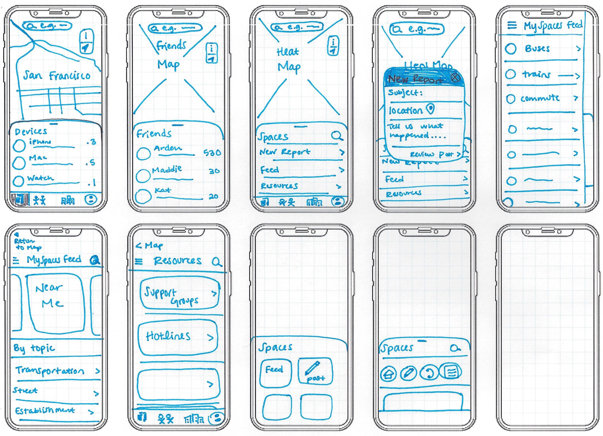
During this prototyping stage, I focused on seamlessly integrating a third service, 'Find My Spaces', within the existing 'Find My' platform. Rather than create three distinct user journeys for initial user testing, as it was unclear which user journeys would prove most important to users, screens were prototyped to allow participants to explore the flow of the app and provide feedback.
These low-fi wireframes were discussed through a co-design session to evaluate the concept's framework and function at a basic level. From these conversations, changes were integrated and low-fi Adobe XD prototypes were used to explore possible UI layouts, with a focus on global navigation and potential user journeys

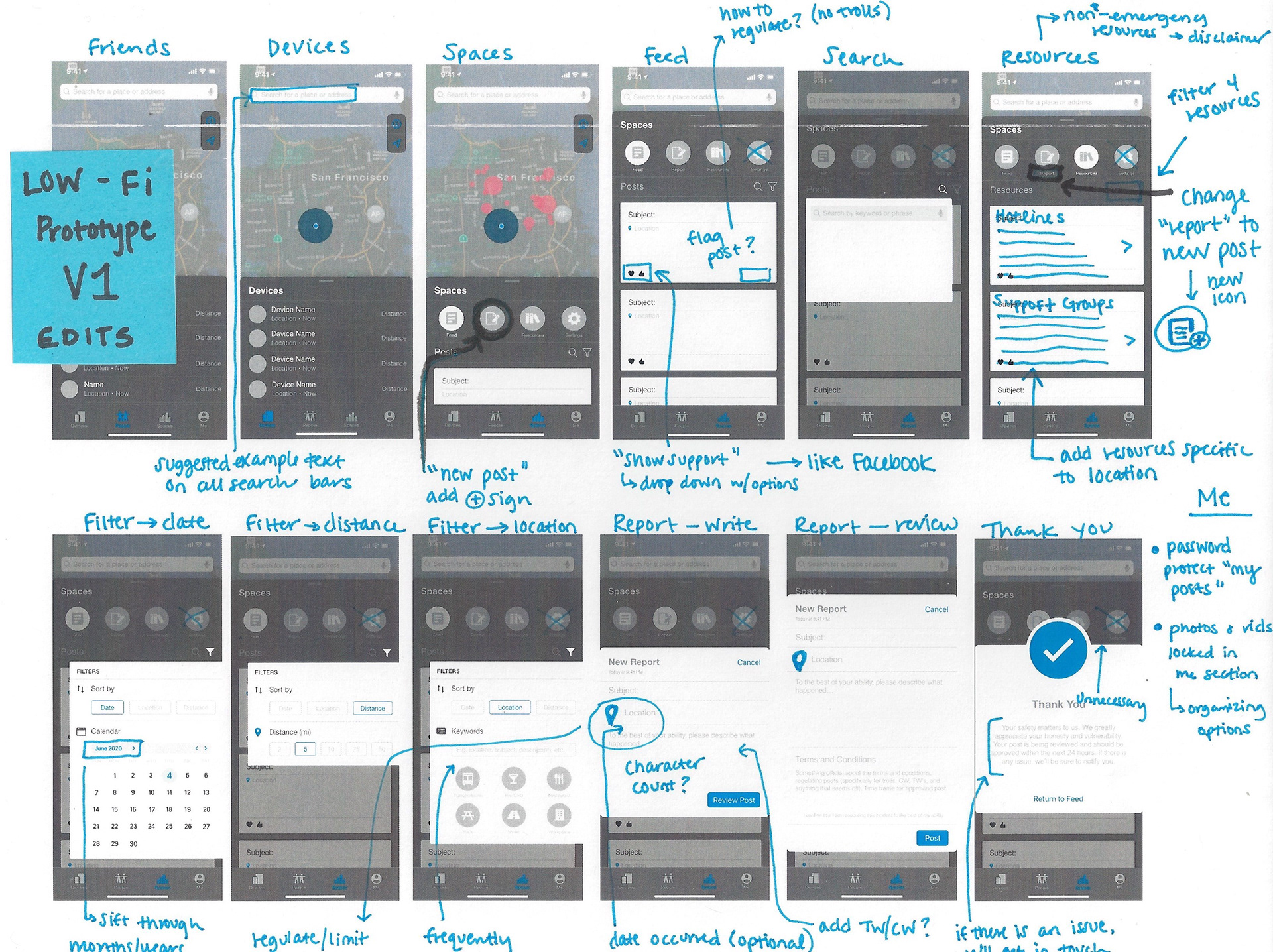
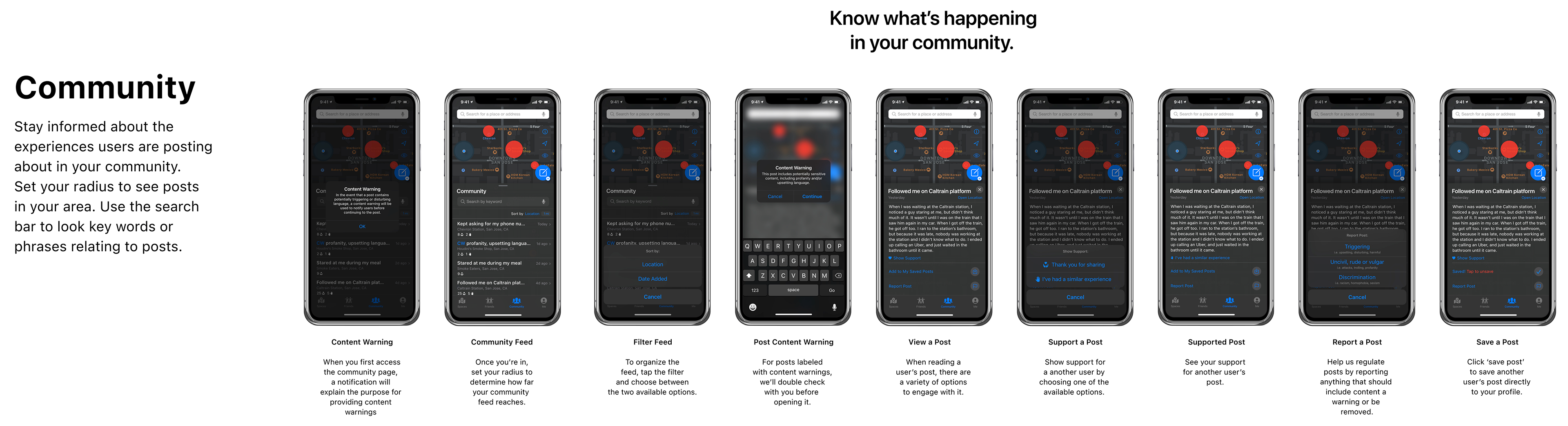
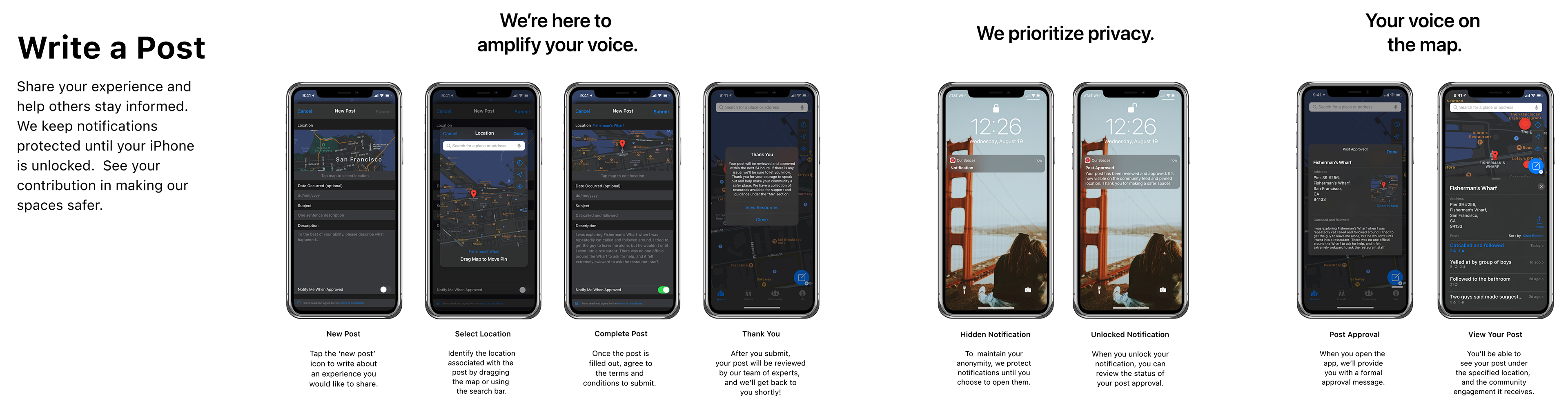
Following initial user testing, the low-fi prototype was modified to better fit the user’s intuition. Once the changes were integrated, a hi-fi prototype was tested to evaluate the application’s home page, ‘posts’ feed, ‘writing a post’ pages, and resource pages using Nielsen's Heuristic Evaluation. The usability issues were organized using Nielsen’s Heuristics: 10 Guidelines, identifying the positive and negative aspects of these four main pages in relation to each usability heuristic. The Web Content Accessibility Guidelines (WCAG) (Kirkpatrick et al., 2018) was used to organize the accessibility issues. Once this process was completed, all of the negative feedback was ranked using MoSCoW (Clegg et al., 1994) technique to organize which usability and accessibility issues would be addressed in succeeding iterations.
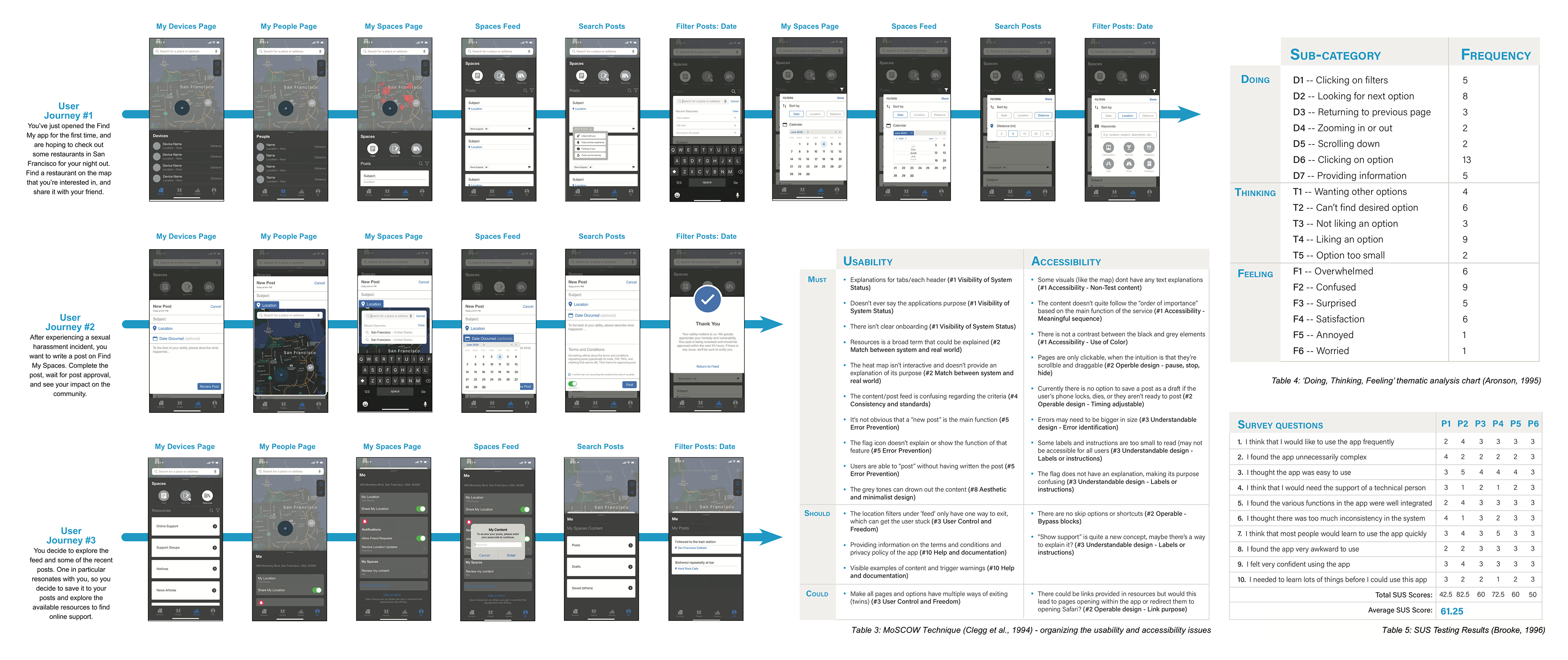
Following this test, a set of quantitative and qualitative methods were used to measure the satisfaction and performance of the app. Six participants, who fit the user criteria, were recruited to test the prototype, each participant was asked to complete a task within each of the three distinct user journeys, which was screen recorded and transcribed.
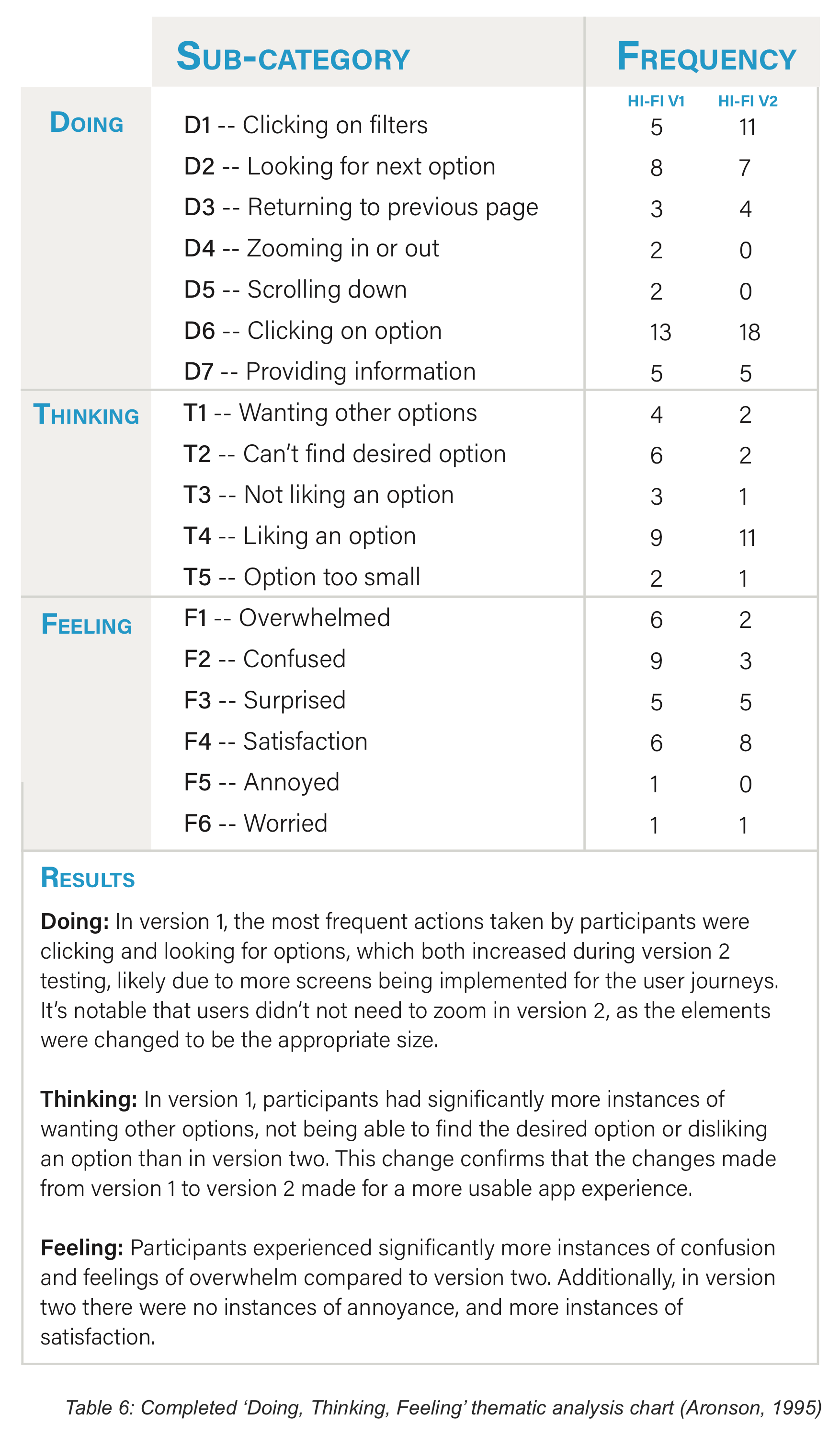
For the quantitative method, a System Usability Scale (SUS) (Brooke, 1996) was used to ask participants ten questions about their experience using the app, which then produced a score for the application’s usability. From the recordings, the success rate and task time for each of the user journeys was documented to measure the performance results. For the qualitative method, video recording and transcription services were used to capture users “thinking out loud” (Jaspers et al., 2004) while completing the three requested tasks. Once the recordings were transcribed, the information was categorized into three sections: doing, thinking and feeling. Within these categories, the information was sorted into a code book to identify the frequency of these codes. Following this process, the designer used the feedback from each of the tests to implement the necessary changes to the prototype.
Once the changes were implemented, the second hi-fi prototype was tested on six new participants. Users were asked to complete a task within each of the user journeys, and the same satisfaction and performance tests were conducted. Once completed, the first and second hi-fi prototypes were evaluated.
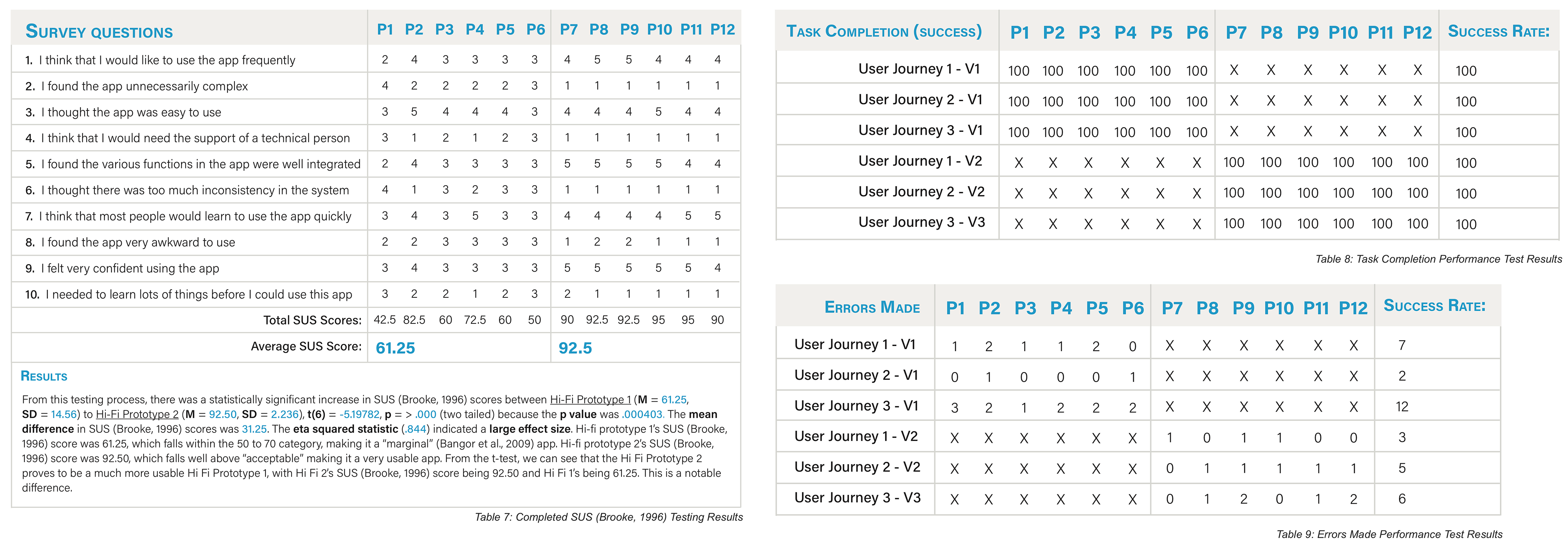
From the user testing, the quantitative and qualitative satisfaction methods revealed that the Find My Spaces app showed a significant increase in usability and accessibility from the first hi-fi prototype to the second, with the second falling well above the “acceptable” margin (Bangor et al., 2009).
The key challenge within this project was remote testing due to COVID-19. With the project’s focus being on sexual harassment in public spaces, the data had to be viewed through a cautious lens. I was acutely aware of the need for in-context testing, despite the app’s high usability and accessibility score.
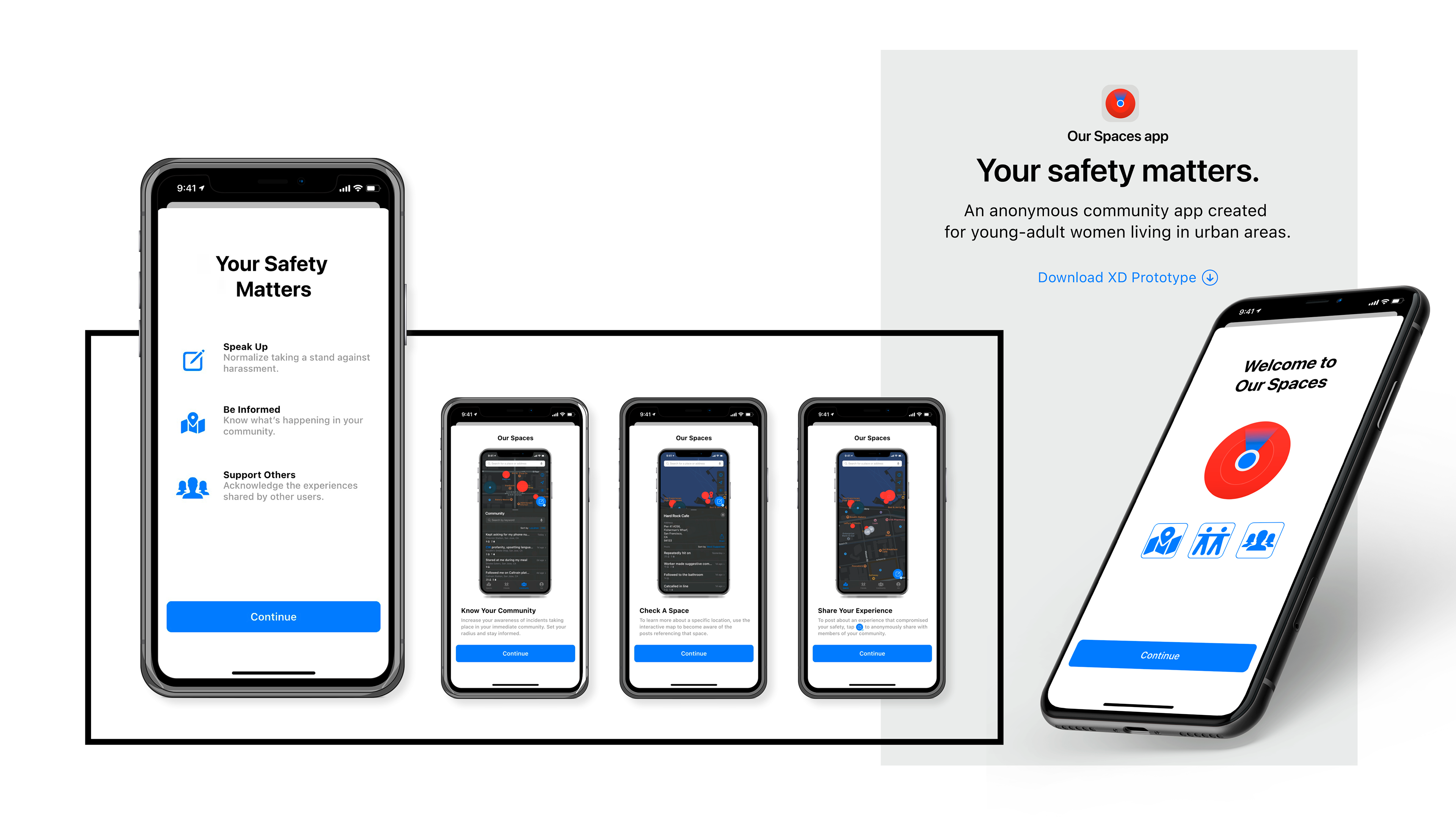
FINAL DESIGN
An anonymous, community-based, digital platform that empowers users to stand up and speak out against sexual harassment

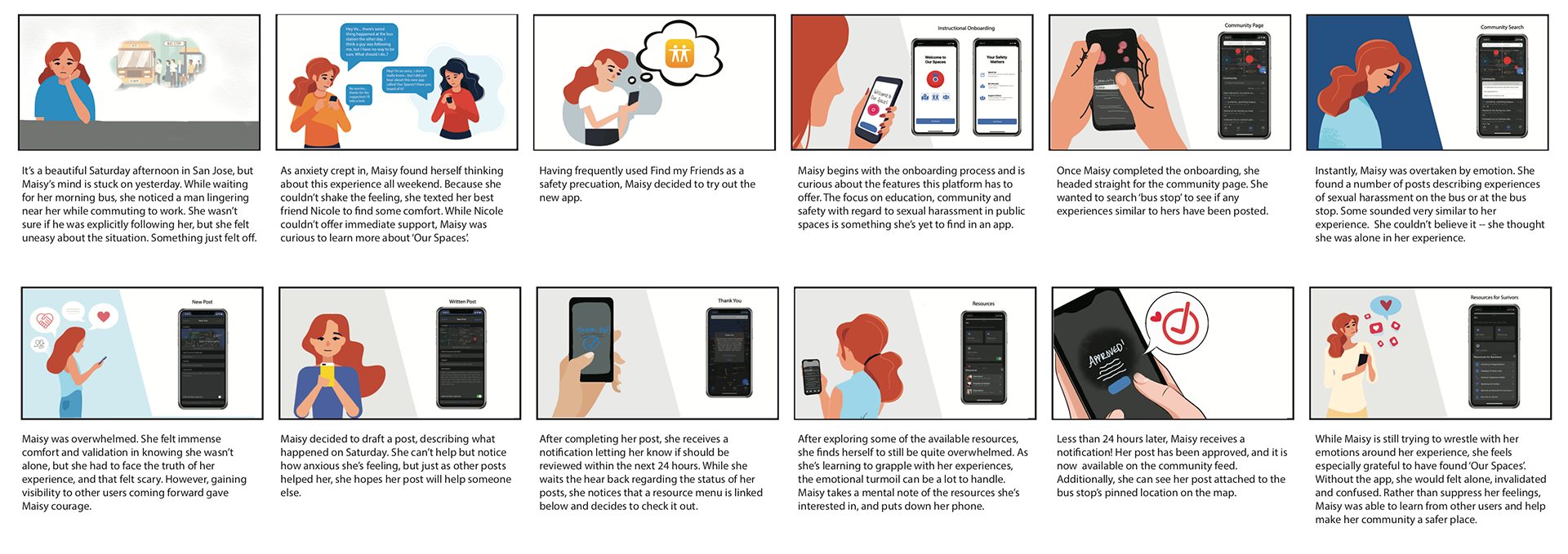
USER STORYBOARD